29 Oct 2007

17. She's the flutter in my heart, the spring that's in my step...

Ahhhhhh annotating the lyrics ... this really should have been done ages ago. But we've finished filming now, the promo looks awesome, the final thing is going to be even better, so I may as well scratch this off the list.

Tried to import the film to the laptops today but some stupid lad decided not to charge his camera so it ran out of battery while importing ... then refused to even give me the tape.

So I spent the lesson doing the lyrics:

Strokes Lyrics

Not much left to do now:
  • Research - The institutions The Strokes represents and major convention of indie videos and how we've incorporated them.
  • Upload our focus group results.
  • Upload our story board.
  • One more textual analysis of a video that combines the stars face and visuals that reflect the music.
  • Just general editing and burning which shouldn't take long.
The food on shoot Mr M tasted very nice thank you but your views on Final Cut seem to be a little flawed, the capture clips was very rubbish compared to adobe. However the layout seemed the same and I think it has the tool I want so it's not a complete let down hehe

Hope everyone else’s is going well

Laters

28 Oct 2007

16. A Call and Response

Right first off, thanks to the three that commented on the promo! Now I'd just like to respond to Mr. M's comment in particular, I'm doing it here because I also cover some of my reasoning and inspiration behind certain decisions.


1. 'Jack looks the part as white t-shirt chef through the servery 'window' although doesn't seem to be doing much work'

Jack said that "this is what real greasy spoon chefs do! They stand at the kitchen window looking hard!". Haha, well anyway I thought I'd just let him have that one, but I still got him to move around (basically anytime he moves around the kitchen is when I've shouted at him to "move around a bit more!" whilst waving my arm in a circular direction above my head. I wanted him to move around because there's a bit in one of our practices in which someone in the corridor moves past the window of the door of 101, and it looks good because it's a tight framing (that whole thing of stuff moving faster in a tightly framed close-up all applies here). So that was my direction with that.

2. 'Zal does a great job'

Zal is awesome. Acting in slow-motion has never been made to look so easy! I love the effect when he leans into the camera to say something, fills up the frame and really makes it look like he's talking to just you.

3. 'Paul and his disappearing fingerless gloves has certainly got ants in his pants!'

With Paul I'd told him to have an "animated discussion" with Rob (I actually told him to say "Malkovich, Malkovich, Malkovich" repeatedly cos I'd seen Being John Malkovich for the first time the other day lol, nerd alert), with lots of arm/body movement. I did this because it looks good on camera in double speed. I didn't see the point of using the effect if it wasn't going to be utilised to it's maximum potential!

4. 'Did you snap the camera onto the tripod after your initial handheld track?'

I actually kept it on the tripod for the whole take, as it would've been too difficult to film the opening bit of the guys inside the kitchen steadily. It's a shame because I had an idea to "do a Children of Men" (the car-attack scene in the New Forest, anyone? With the in-car rig swinging the camera in and out of the windows, anyone?) and start the filming in the kitchen (Jake would do that), bring the camera through the hatch (by handing it through to me) and then continue as you see in the promo, but the tripod wouldn't fit. Plus there would've been problems with Jake not being too obvious in handing the camera over, he is acting in the scene after all. But yeah, I was pretty damn pleased with the tracking shots, because that was without a dolly and any minor shakes would've been multiplied in the fast-motion effect. I was also pretty pleased that I managed to settle the tripod down in front of Zal without a horrible, jerky bump. So yeah, bit of blowing my own trumpet, but there you go!


Right what else...nope, nothing, for now...

Just good luck John! But don't try too hard! :P

27 Oct 2007

15. You don't half pick your moments to talk about, the things you never wanna talk about...

Time to feel everyone in it seems.

Guess what ... we filmed everything on Friday morning and it went really well :D.

We filmed in the Woolpit museum instead of the village hall I think because it was cheaper to book and easy to organize.

Here is what it looked like when we got there:

Empty

Then after we built our set from basically scratch (we only had tables and chairs to work with) we managed to create a sorta greasy spoon looking set:

Everyone helping outNicholls' & Sibley's Greasy Spooner

Although dad said that there should have been tomato sauce bottles on the tables rather then just salt and pepper shakers. However, for the first set we've ever created out of nothing we were pretty pleased. To light the place we made filters by shining light onto tin foil sheets, as shown in the pictures here:

LightingMore lighting

So with the set ready we had to prime the actors. Appearing in the kitchen would be our two Jack chefs Mr Stanton and Mr Brown, appearing as two cafe customers would be the keen animator Mr Cooper and our good friend Mr Miller (returning for a part longer then half a second this time), I was a somewhat camp waiter and Mr Sibley filmed the whole thing with the help of my camera (dad wouldn't let me borrow his in the end) and my tripod. Our star man being the legendary Zal Jones, a somewhat student film veteran now. The crew:

Mr Stanton, Brown, Sibley, Nicholls and JonesMr Cooper and Miller


Filming went well we had about two or three dress (not filming) rehearsals to make sure everyone knew what was going on. We then had a filming re rehearsal, James went around holding the camera and everyone started to act. We then took two takes with actual acting and real food for Zal to eat (cooked by me and Mr Stanton and prepared by Mr Brown), they both went really well and I managed to edit the footage from take 1 into a small promo here:


Watching back the footage highlighted a few problems:

  • In both takes (you can see in the promo) as Zal walks out the cafe you can see our lighting stands, however in the second take Zal has finished singing the song by this point so by some careful editing we should be able to edit out any notice of this to the audience.
  • My fear that the table was too over exposed may be in affect, in youtube form it does defiantly look more exposed however it looks good on the computer screen.
  • The sped up part will be very difficult to edit using iMovie. I used Adobe Premier Pro CS3 to edit the promo which has this handy tool that can stretch video clips to fit in any gap, so I jus edited the speaking parts, left a gap and then plonked the sped up sandwich eating bit in there and stretched it to fit. Whether final cut has this tool is a different question though.
However negative this may seem, I was very pleased when I finished editing, as we played the Strokes at half speed in the background of filming and made Zal mime to that, then speeding it up was very easy as I only had to had to set the clip 200% (speeding it up by 2x). I had quite the jig after first look and after the final thing was edited down I was very happy with it. It is obviously a very rough edit, for example the stills at the end could change to match the drum beat, but never the less I was throughly pleased with it.

Hope you enjoy ... more still I hope when we edit take two into the real piece of coursework it will look truly awesome ... things are looking likely to that fact.

Now filming is finished, I'm planning to start the evaluation soon, all the way up to editing, as all the planning has been done now. Annotations of the lyrics will also be posted shortly.

Yay ... hope everyone else's production is going great ... see you all soon.

Laters

20 Oct 2007

14. I came, I saw, I conquered ... so Mrs B if you want this encore, I need you to scream, 'til your lungs get sore...

Hey everyone,

Hope everyone’s half term owns as much as mine so far. So happy to be taking time off school ... really needed the break from intellectualness if you get me? Right as there hasn't been a post on here for 10 days I may as well give an update to our current situation.

To do list:

  • Research - We still need to do a focus group and look at the institutions behind the Strokes and the general indie scene they represent.
  • Finish the storyboard (We shouldn't take long as our production is only six shots long).
  • Textual Analysis - Already done "Heart In A Cage" and "Ayo Technology", still gotta do "Sledgehammer" and one where the music is reflected in the video (any suggestions).
  • More themes of professionalism to add to the general pile - Currently just using a really decent camera.

Also after looking at the previous student videos I created a "Things to avoid list":

Things to avoid list:

  • Bad exposure - Classic mistake for making the video look really amateur.
  • Young kids or trying to act - We're young we can't act yet ... FACT!
  • Video effects - Ghost trail just looks rubbish because everyone uses iMovie so the real skill is making it look original.
  • Lyrics shown too obviously - Not everyone watching is intellectually challenged ... keep it subtle.
  • Make up - You've just been hit by a car ... your body has been scrapped across the road and your bones are broken ... but no wounds ... who you kidding?
  • Darkness - Unless you’re making a foreboding video ... and to memory none of them were ... don't use darkness because the camera we use are so bad at night ... trusts.
  • Poor ending shots - I've just sat through an awful song and you've presented me with a very weak narrative ... at least try and end on something memorable.
  • Room to "talk into" - Mr Morrison put extra emphasis on this ... and of course he's right ... it does look very silly if you have your basic close up and there’s half the shot behind the person's head.

So yeahhh keeping the ball rolling. I do seem very negative about the student productions however I did particularly like:


Now to a weekend of disappointment to look forward to.

Don't get wrong I would love England to win the rugby world cup and Hamilton to win the F1 but come on we're English therefore we always fall hard when we're playing well ... just look at Russia. Rooney's goal was just orgasmic though :).

Laters...

12 Oct 2007

13. There is lightning in this room, above our heads, waiting to strike, I'm a thinker not a talker...

Ha this is like last year all over again. The joy of studying such an awesome game. I don't care how nerdy it sounds San Andreas is just awesome. Now if you had told me like 3 years ago I would be studying San Andreas and voyeuristic 50 cent videos I doubt I would have believed you.

Ah yes a fresh new video for you to pour your sizzling opinions on. I doubt I'm the only person in the class to prefer mainstream music videos to the award winning directors we've been studying. No offence to Michel Gondry or Malcom Glazer or the rest of them, they have made some very inspiring videos. However for me music videos need a high energy to them, without that being a live band playing. Not saying the Aphex Twin didn't have a beat to it, only I prefer something I could watch with my sister in the background. Something for people with simple needs and very simple audience pleasures.

Although it was quite worrying earlier my 10 year old sister explaining this song is about how a girl wants sex but that’s more a subject for Cat and Lauren's CRS.

50 Cent - Ayo Technology


Firstly this video is set in London, which is a city I love buildings wise, so the shot where they pan down from a bridge to them in cars, even if it’s all CGI, stirs my coffee very well. Also the quick opening helicopter shots of the London eye and the house of parliament in the dark are also very pleasurable.

Ultimately these wonderful shots are pointless, along with the shot of 50 cent at the start holding a sniper rifle for no reason. These are quite obviously used to promote the wealth (rich well respected trademarks of London and the flashy expensive sports cars), power (being able to pleasure women with the touch of a button) and gangster prowess (the sniper rifle) of the only and only 50 cent.

On that little sheet we were given, Goodwin waffles about:

There is likely to be reference to voyeurism, particularly in the treatment of females, but also in terms of looking (screens, binoculars, cameras etc.)

Now Goodwin must have been theorising about this video as it contains lots of these features. At one point (1:24) Justin is even looking through X-ray binoculars into a women’s hotel room for goodness sake!

There is also a lot of inter-textuality in the video, whether it’s meant or not. Such as 50 cent is dressed like he's out of Reservoir dogs without the glasses, Timberland has the glowing glove moving screen board thing (which if I'm very much mistaken is "borrowed" from Minority Report), and the dancer at 2:38 is wearing exactly what Fergie did in her video for "London Bridge" minus the union jack underwear.

Now the lyrics are quite self explanatory, so much so as I said my sister understands them. The video is much dictated on technology and how these three maestros use them to pleasure the endless women that surround them. However I think I heard the original lyrics were about pornography rather then technology. So the slight change works well for creating a MTV showable video.

All in all it is a very stylistic video of Joseph Kahn's works, and if you've seen the "Britney Spears - Toxic". Very loose narrative that relates to the songs title and nothing more, random shots of loose women, technology/spy themes and random shots of the leading artists dancing to a plain coloured background.

Now for some questions, answers with opinions would be appreciated much better than just yes or no replies...

1) Is the opening shots of London too short or do you prefer the quick introduction of location, thus the video concentrating on the song more?

2) This opening shot is book ended by another similar CGI effect, did you enjoy this shot or would you have preferred they ended the video with a conclusion of narrative? I.e. what happened to the girl Justin was playing around with behind a door.

3) Were the lyrics reflected well in the video, or would you have preferred the video to be more narratively dominated?

4) General opinions on costume? Was it looking smart for the point of looking "cool" or do you prefer the artists to be wearing an outfit suited to their genre?

5) Is the fast paced editing too much or does it reflect the energy and upbeat feeling of the song more?

Saying all I've said I still like this video, although it's not Kahn's best works. Watch this space...

P.S After some more messing around we have our second film full of tester shots. This time instead of lip syncing we tried messing around with walking at normal pace with people in the background moving in fast motion. Anyways this was a productive use of a double lesson ... honest:


6 Oct 2007

12. I am Jack's wasted life

Right I'm up on Saturday night doing homework, I'm cool, I know. And be warned this post is going to be a marathon.

Now to the point. As I mentioned earlier, we plan mise-en-scène to be a big part of our production, with the aim of creating (or arranging) our own set and lighting it well to maximise the end quality of our media coursework.

In light of this, coupled with the fact that we plan to set our music video in an American style diner/café, I began to think of cases in which bars, cafés and diners have featured in film; with a view to analysing how they were presented and what the mise-en-scène in said scenes was like (and what we can draw from this anlaysis). Almost immediately I had two scenes that I wished to analyse, both of which appear below. The first is from Fight Club (David Fincher, 1999), one of my favourite films and one of favourite scenes in it (it'll be explained in great depth below). The second is, again, from one of my favourite films and is, again, one of my favourite scenes. This time the scene in question being from Goodfellas (Martin Scorsese, 1990).

Then, as I settled down to write this blog post, my mental wanderings came upon another scene from another film. This time it is from Reservoir Dogs (Quentin Tarantino, 1992). A film that, while not adoring, I like. However I think I'm duty-bound to point out that Jake has immoral dreams about the man who directed it.

Bar Scene - Fight Club (David Fincher, 1999


While I'm mainly concerned with the the bar-orientated section of this clip, the section outside the bar is also of use as we are considering ending our music video with the central character walking outside into the car park of the diner/café. Thus I'll split the analysis into two.

Inside

What immediately strikes you about the scene is the muted palette of colours used by Fincher. The blue-grey of the upper walls and concrete pillars, black of the leather seats and sober brown of the tables and bar makes for a cold, dark and dingy bar atmosphere. Yet more than this it makes for a seedy atmosphere that nicely introduces and represents the seediness that is later to be revealed as a central part of Tyler's character.

This seediness is heightened by the director's use of focus and lighting in the scene. The sight of the various patrons of the bar moving around the behind the two characters out of focus and in the shadow cast by the hanging, partially-covered fluorescent lights creates a furtive atmosphere, in which people's faces and physical distinctions are hazy and unclear. This clandestine atmosphere is furthered by the presence of a group of pool players that can be seen behind the narrator's head. These subjects are lit by a smokey neon-blue light that only lights the (still out of focus) lower section of their bodies. The lighting used in the rest of the bar is quite low-key, with dim, covered wall-lamps that cast light up the wall they're attached too (which means that the bar patrons are dimly lit, adding to the atmosphere). Contrasted with this is the lighting and focus used for the two central characters: well lit, with their faces being fully lit and in clear focus.

One obvious effect of all this is that the audience's attention is focused upon the two central characters and what they say (it is a pretty important dialogue, it reveals most of what Tyler acts upon later), mainly because there's not a lot else that's clear enough to look at.

However it could also be said that an effect of this lighting and use of focus is that the audience is provided with a source of mystery, they cannot draw any solid conclusions from the character's location as they cannot see it or it's patrons clear enough, this can only leave them with a sense of mystery. Another closely related effect of the director's use of mise-en-scène is that the audience's attention is mainly focused upon the two main characters, yet their eyes will wander over the background in an attempt to discern details (in vain). This builds the secretive, mysterious nature of the two characters; they are sitting in a furtive bar filled with shady individuals that only interact with their immediate group. The audience are left to ponder what sort of character Tyler is to have taken the Narrator to this type of bar for their first meeting.

This sense of mystery and seediness created through use of focus, lighting and colour is something that I'd like to replicate in our own production. We want to introduce the character that is going to miming along to Last Night and we want to introduce a superficial "character", but we don't really want to divulge too much information about what kind of person they are or their nature, something (I feel) we can reinforce through similar use of mise-en-scène.

Outside

Now I've chosen to analyse the outside section of the bar scene in Fight Club because we ourselves may also have an scene in which the central character walks outside the front door (see my reasoning lol)

A
nyway, the mise-en-scène is very similar outside. The fact that the scene takes place at night time already establishes a bleak atmosphere. Yet the colour, lighting and props that Fincher uses only reinforces this. Again the grey-blue appears, being used for the entire outside wall of the bar; as with inside of the bar, this creates a cold, dingy feeling.

Fincher again bolsters this dingy feeling through the use of cold, flourescant lighting (actually a lot of this reminds me of some of Jonathan Glazer's work, i.e. Richard Ashcroft - Song For The Lovers) and hazy sodium street lights. This low-key lighting creates an a very atmospheric mood for the scene, with the fluorescent lighting casting long shadows up the wall of the bar and creating a soure of back-lighting for the two main characters, the sodium street lamps then create deep shadows on the two character's faces and clothes.


Fincher also uses props to great effect in the outside portion of the bar scene. The rubbish bags, wheelie bin, wet and puddled tarmac and discarded empty beer bottles create a decrepit feel for the area outside the bar (how many bars have you been to that keep rubbish bags outside the front door next to the payphone?). This subtley links in well with what Tyler was saying in the bar ("stop being perfect") and what his "life" is later revealed to consist of: a dilapidated abandoned house and a business that consists of "selling rich women their own fat asses back to them".

This all works to generate a very strange mood for the scene that I can only describe as a "late-night with no-one about" mood, except it is exaggerated to an almost surreal level (or maybe I just lead a sheltered life) by the Fincher's use of mise-en-scène. Something that I feel we'd like to emulate entirely for our closing sequence of shots as it fits the morning-after-the-night-before mood we're trying to match to the song.

"Billy Batts" Scene - Goodfellas (Martin Scorsese, 1990)


The next scene I'm analysing is a bit more simple, in that I will mainly be concentrating upon set design and props, with a little bit extra added from the other aspects. Anyway, it's a classic scene from Goodfellas (Martin Scorsese, 1990) in which the three guys murder a "made-man" in a diner/café. It's mainly that last bit that intriques me.

Now Scorsese created the set of this scene as a small American diner. There's a well-stocked bar with small black leather, steel legged bar stools lining the counter. Lino covers the floor and every other space is filled by black leather corner chairs and tables covered by white tablecloths. This is a style that I feel works for it's realism, and it is a type of set that I hope we can emulate for our own production. However I don't think we'll be putting a jukebox in ours.

Again, as with the Fight Club clip, low-key lighting goes a long way to creating an almost foreboding atmosphere. However the major difference between the two is that Scorsese (I'm of course believing purposefully) has had the main characters smoke, this has filled the room with smoke and heightens the low-key lighting by making the light seem lazy, as it struggles to penetrate the smoke. While I feel that achieving this effect would be hard (partly because of the smoking ban in public buildings, partly because of smoke alarm problems and partly because I'm not going to force our actors to smoke), I feel it is a very effective effect, and is one that we could look into mimicing through other means.

Intro Scene - Reservoir Dogs (Quentin Tarantino, 1992)

Unless you're Abi, ignore the Spanish subtitles in this clip!


The final scene that I'm going to analyse is the introductionary café scene of Reservoir Dogs (Quentin Tarantino, 1992).

Now this scene is probably more relevant to ours in that it is set in the morning. This shows through with the lighting, with each of the characters being lit with that fresh morning light, with a weak light coming in from the side and mainly illuminating one side of a character's face (this could be interesting to use in our film, a faint shadow across one side of the character's body). This light works to make a fairly "crisp" atmosphere to the scene, something that is heightened by the white tablecloths, whitewashed walls and pillars and the black and white (bar one) nature of the clothes of the characters sitting around the table.

While this crisp, clean look is good for what Tarantino is trying to achieve - reinforcing his presentation of the group of characters as a group professionals (they're wearing suits for Chrissake) - it isn't entirely suitable for how we want to portray our central character. Mainly as a rough feeling (and looking) man who's recovering on the morning after the pretty wild night before. This is why I feel that we shouldn't use white everything prop-wise in our film (and generally decorate it like a tearoom), as this could make the character either look out of place, or take something away from the vulgar, shabby portrayal of the central character.

However one aspect of Tarantino's mise-en-scène that I feel does fit the fact that he's designed his set to make it appear "busy" visually. Behind the characters there is usually a large jumble of chairs, tables and pot plants laid out, as well as patrons and waitresses wandering around. It is this sort of crowded visual style that I think we should use for our music video (especially the people moving around bit, this is pretty integral to our video really) as it gives the frame more interest other than rows upon rows of lined up tables.

Fin

So just to sum up. we'd like to steal Fincher's lighting and colour, Scorsese's set and smoke and Tarantino's prop placement and framing. Hmm, maybe I should stick to saying we'd like to "emulate" them...

So this is the end of that marathon post. If you read it all, thank you, you're my new hero. Only two questions:

Which of the clips/set designs did you prefer? The bar, diner or café?

and...

Any particular aspect of mise-en-scène in any of the clips that you particually liked?


Sibley

P.s Now fixed the videos so there embedded now James...

5 Oct 2007

11. My alarm clock he ain't working, but that don't really mind, cos he ain't no friend of mine...

So yeah ... had a fun lesson to day. No Morrison so we all WORKED hard, got ALOT OF WORK DONE, USED OUR BRAINS TO THINK and PRODUCED SOME DECENT STANDARD WORK. I made A VIDEO!

Well yeah that ... and also I spent two hours editing, with James happily looking around York, and also finishing our concept tester see what you think:


Yes, yes, I know I look really hot in a tie you don't have to comment and tell me that. Now to try and put a positive spin on what appears to be a complete waste of time:


  • There has to be people in the background or some movement of some kind of it just looks like in the tester as you can't really see the effect on the video.
  • Lip syncing shall be hard but not impossible, the last word of every sentence is easy to sync just the middle of it was hard.
  • Dad's camera produces a very clear and crisp picture even on you tube :)
  • My hair is very soft to touch and smells of minty head & shoulders, also my mum makes killer banana cakes
  • If we play the song at half speed or quarter speed and mime to that ... all we have to do in the editing it double or quadruple the speed of the footage ... whilst still creating the same effect
All in all the concept works and should produce and interesting video … we hope.

After reading all this ... please leave a comment on The Strokes video in the post below this. It will be very well recieved if you do :D.

Anyways hope everyone has an awesome weekend, I know I sure will…

3 Oct 2007

10. I went to the concert and I fought through the crowd, guess I got too excited when I thought you were around....

Ergh doing homework in a study how nerdy am I but I must thank Eleanor for letting me borrow her library card as mine is at home.

SO THANK YOU ELEANOR!!

Mr M said it would be a good idea to have a little online focus group thing. So if you wanna skip the bulk of this post and just comment back with your opinions on the ending questions then that would be fantastic. I give a nerdy myspace guarantee that I will do a comment answering my questions in return for a comment on any of your blogs :).

So I was thinking if I post my textual analysis on here then it saves me having to print it off on paper to hand in and it also allows for people to comment on the video thus creating and online focus group thingy.

So as previously mentioned I've decided to study The Strokes videos as we will be borrowing one of their songs, their indie and I love hearing there music again and again.

The Strokes - Heart In A Cage


So for my first attempt I choose "Heart In A Cage" as it very aesthetically pleasing. The song has also a lot of layers to it. I've already posted this before for an idea ... but hell I'm going to post it again as it's just such a favourite song of mine.

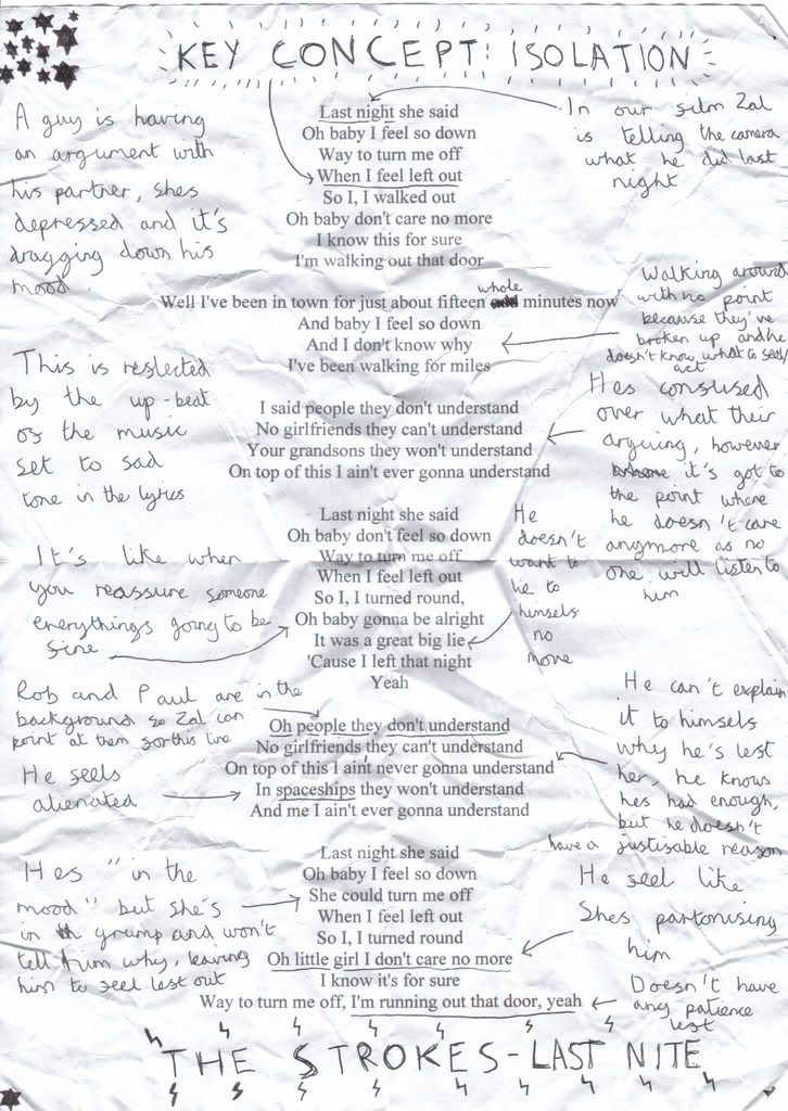
The lyrics can reflect two meanings. However only one is reflected in the video. First the song could represent a break up between the narrator and a girl. The guy’s heart feels trapped in cage as he stuck at the dead end of a relationship and deciding on what to do next:

Oh my heart beats in its cage, all our friends, they're laughing at us, all of those you loved you mistrust, help me I'm just not quite myself, look around there's no one else there, I went to the concert and I fought through the crowd, guess I got too excited when I thought you were around...

However the meaning which is more reflected in their video of the song is the sense of feeling trapped in a city which has no community spirit. The lead singer (I think he's called Casablanca, what a surname!) is describing how it feels like to live in the featured New York city when he rather live in a more rural location. Casablanca’s then combines these two feelings of entrapment in the verse:

I don't want what you want, I don't feel what you feel, see I'm stuck in a city, but I belong in a field...

The video is shot in New York and in monochrome; this gives a very stylish look to the video. To add to the sense of being crushed in a vice by a city, Casablanca performs most of the song on the floor with the surrounding people almost trampling him.


The shots on the roof of the building almost ended killing the guitarist as the 40mph winds almost blew him off (thanks wikipedia for that fact), however the ending shot of dropping the guitar off is so rock and roll it hurts.

Now for some questions, answers with opinions would be appreciated much better than just yes or no replies...

1) Is the opening shot of the speed up sun rising in New York city too short or do you prefer the quick introduction of location, thus the video concentrating on the song more?

2) This opening shot is book ended by an equally fast paced ending shot of the clouds, did you enjoy this shot or (like me) would you have preferred they ended the video with the dropping of the guitar?

3) Were the lyrics reflected well in the video, or would you have preferred there to be a narrative to explain the break up story side of the lyrics?

4) General opinions on black & white vs colour?

5) Is the fast paced editing too much or does it reflect the energy and upbeat feeling of the song more?

So yeah ... any opinions would be marvellous.